Released Feb 2018
8500Y
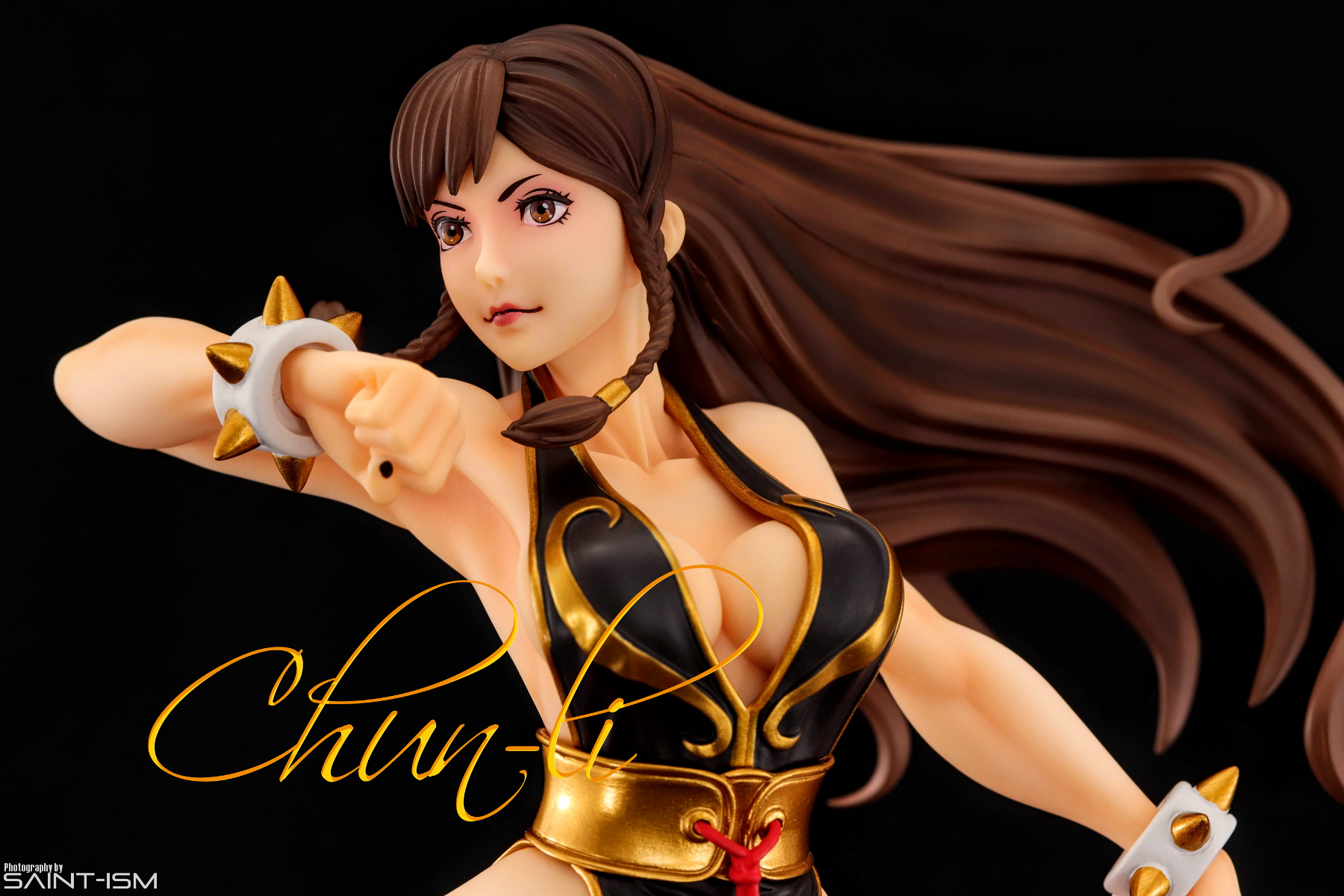
Chun-li gets all the costumes in Street Fighter V and now her best one has gotten the statue treatment via Kotobukiya’s “Bishoujo” line.
For those not familiar, the Bishoujo Statue line is a series of statues based off of Shunya Yamashita’s illustrations of various movie, game, and comic characters drawn in an anime style. The series includes characters from Marvel, DC and Street Fighter. Followers might remember that I picked up the She-Hulk statue from the same series when I went to Japan in 2016.
When I first spotted her for pre-order earlier this year, I was instantly sold on the powerful and elegant pose. It’s pretty simple yet there’s a really nice sense of movement and action in it. Her hair, dress, right arm and left thigh act as nice frames that direct your eyes at her at all the right places. It also helps that she’s wearing one of her best costumes from Street Fighter V that gives you a great view of her physique.
She’s pretty well painted, and you can’t really fault her when viewed from afar. I have to say I really like the skin tones. There’s a real warmth to it, and enough shading to bring out the muscle definition on the sculpt. There are a just few missteps though, with only very minor bleeding on the various gold trims being visible when magnified through the camera lens. It’s most noticeable on the gold spikes on her cuffs.
What’s with that face?
I was originally quite skeptical about her face when I received first her (as were many others), but after taking pictures I think it actually looks alright. It’s definitely not dead on arrival like the Kotobukiya Saber figure I took pictures of. The eyes on the final piece look further up compared to the prototype and illustrations but it makes a bit more sense for the pose overall. My only critique would be the shape of the eyes look like they are bulging out way too much when she is viewed from her right or back.
Thighlights
Ever since Street Fighter 3 3rd Strike Chun-li has been canonically thicc, and this statue totally delivers on that of her design. Theres some very subtle shading that brings out the contours of her thighs very nicely. The only negative I can see here is the little red rope belt on her waist, which seems to be lacking paint. Even a simple wash would’ve brought out the existing details.
Back
Her upper back is probably the most detailed part of the sculpt. While her thighs are pretty subtle, it really feels like they dialled it up to 11 for her back muscles. It certainly is eye-catching but it feels a bit out of place compared to the rest of the figure. I’d even go as far as saying that it might be a little bit overdefined. Maybe because there wasn’t a reference sketch to work off?
Anyway her hair obstructs most of it, and there’s only a very minuscule angle where you can view her from the rear and get the nice contrast of her curves and ripped back before running into the side-eye bulge.
Best Shots
Because of the angle of her face, I found that shooting her from higher gave the best results.
Prints
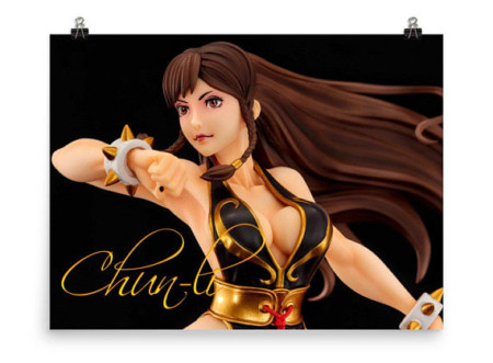
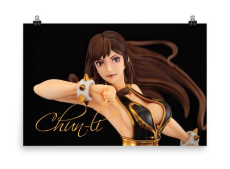
For those interested I have prints available for some of these shots at my Etsy store!


